

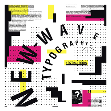
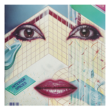
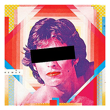
The New Wave design emerged with inspiration from Punk and postmodern language theory, also with inspiration and resemblance to the Swiss Style. In this era, sans-serif fonts are dominating and most frequently used, but the difference from other design styles are how the New Wave Design Style stretch the limits of legibility and create a sense of chaos. You can see inspiration from the Swiss Style in the typography, however its commonly less clean and more rebelling. They also typically use transparent film and collage in the designs in this style. They typically use several different type sized, boldness, colors and fonts in order to create a more “chaotic” look. It has been said that the New Wave is a more soft and commercialized version of punk culture. There is one designer and artist who stands out as being the developer and creator of the New Wave typography, having its birth at the Basel School of Design in Switzerland in the early 1970’s.

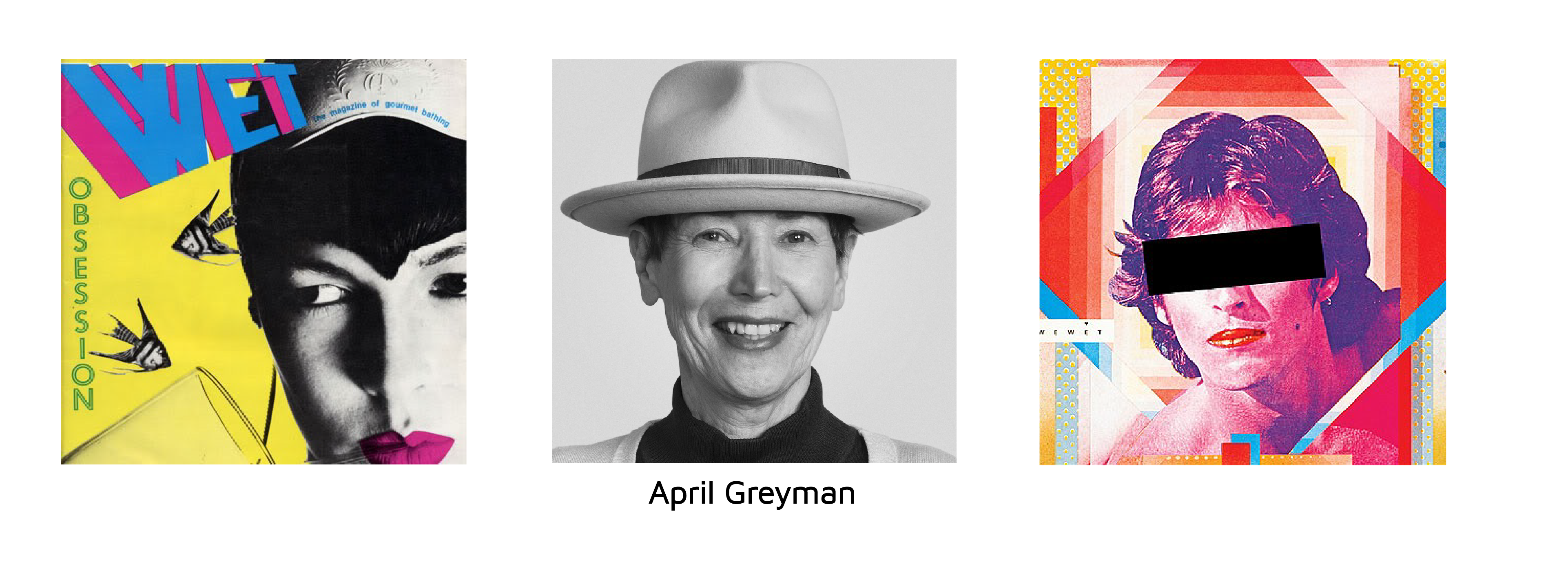
April Greiman was born on September 10, 1948. She grew up in New York City, and she studied art at the Kansas City Art Institute before studying graphic design. In the 70’s she went to Switzerland where she studied at the well known Basel School of Design, where she studied under Armin Hofmann and Wolfgang Weingart, and she soon got interested in the International Style and New Wave. Eventually, she left Switzerland and moved to Los Angeles where she founded something called Made in Space. In the 1970’s digital design was still somewhat new, and many designers were frightened by the development of this digitalization and computer technology. Greiman, on the other hand, embraced it. She used the pixilation of the digital development in her design, and embraced, explored and spread the idea of this new and advanced technology to her advantage in her art and design. Today, Greiman is known as an influential contemporary artist and graphic designer, and she is considered to be one of the first designers of the time to embrace and see the computer in a different light and who truly saw its magnificent potential and design tool. She is also known for introducing the “New Wave” design style in the US. She has received several honorable prizes, while working with art and design, teaching, she has published in magazines, she owns a spa retreat which she designed, worked with and exhibited digital photography, painted murals on huge buildings and she received the Gold Medal for lifetime achievement from the American Institute of Graphic Arts. Today, she works at the Woodbury University, School of Architecture as an art director, and she is quite and inspiration.
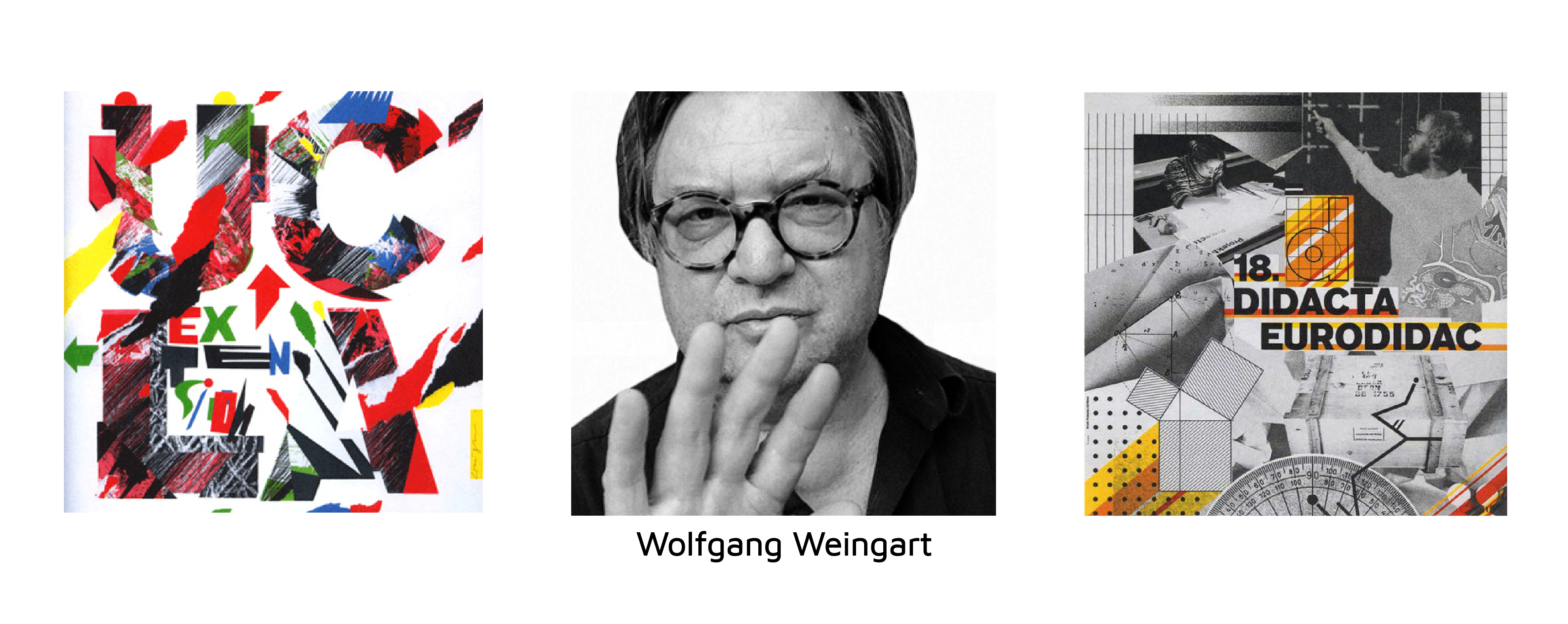
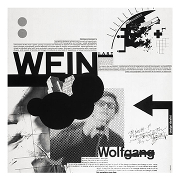
Wolfgang Weingart was born in 1941, and spent his childhood in Germany. He is an internationally influencing and well known graphic designer, and especially known in the punk/new wave style. He has even been acknowledged as the father of New Wave typography. He studied graphic arts in Germany, where he learned about typesetting, linocut and woodblock printing. He developed a strong interest in typography, which lead to him eventually moving on to complete a three-year typesetting apprenticeship in hot metal hand composition at a printing company. During his time there he was encouraged by one of his mentors to continue his studies in Switzerland, and so he later enrolled as an independent student at the Basel School of Design in Switzerland. He excelled in the art of typography, and was eventually invited to teach typography at one of the classes on the school where he became an influential instructor, and until this day he has taught and lectured graphic design all around the world. One of his saying goes like this: “I took Swiss Typography as my starting point, but then I blew it apart, never forcing any style upon my students. I never intended to create a “style”. It just happened that the students picked up and misinterpreted a so-called “Weingart style” and spread it around”.
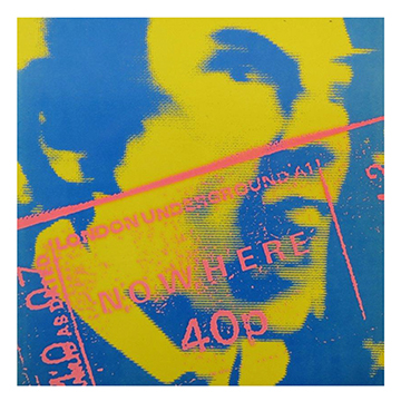
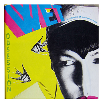


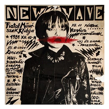
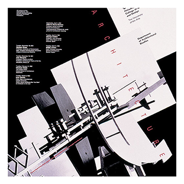

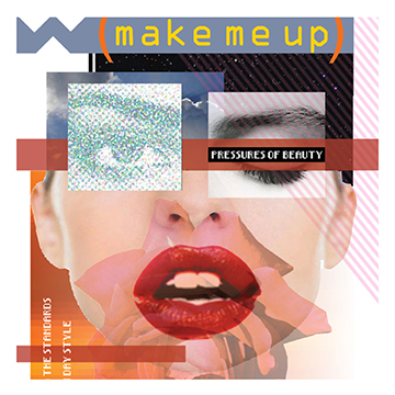
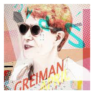
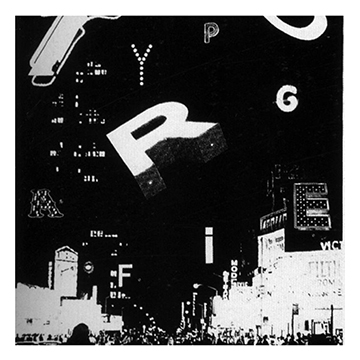

The New Wave design emerged with inspiration from Punk and postmodern language theory, also with inspiration and resemblance to the Swiss Style. In this era, sans-serif fonts are dominating and most frequently used, but the difference from other design styles are how the New Wave Design Style stretch the limits of legibility and create a sense of chaos. You can see inspiration from the Swiss Style in the typography, however its commonly less clean and more rebelling. They also typically use transparent film and collage in the designs in this style. They typically use several different type sized, boldness, colors and fonts in order to create a more “chaotic” look. It has been said that the New Wave is a more soft and commercialized version of punk culture. There is one designer and artist who stands out as being the developer and creator of the New Wave typography, having its birth at the Basel School of Design in Switzerland in the early 1970’s.


April Greiman was born on September 10, 1948. She grew up in New York City, and she studied art at the Kansas City Art Institute before studying graphic design. In the 70’s she went to Switzerland where she studied at the well known Basel School of Design, where she studied under Armin Hofmann and Wolfgang Weingart, and she soon got interested in the International Style and New Wave. Eventually, she left Switzerland and moved to Los Angeles where she founded something called Made in Space. In the 1970’s digital design was still somewhat new, and many designers were frightened by the development of this digitalization and computer technology. Greiman, on the other hand, embraced it. She used the pixilation of the digital development in her design, and embraced, explored and spread the idea of this new and advanced technology to her advantage in her art and design. Today, Greiman is known as an influential contemporary artist and graphic designer, and she is considered to be one of the first designers of the time to embrace and see the computer in a different light and who truly saw its magnificent potential and design tool. She is also known for introducing the “New Wave” design style in the US. She has received several honorable prizes, while working with art and design, teaching, she has published in magazines, she owns a spa retreat which she designed, worked with and exhibited digital photography, painted murals on huge buildings and she received the Gold Medal for lifetime achievement from the American Institute of Graphic Arts. Today, she works at the Woodbury University, School of Architecture as an art director, and she is quite and inspiration.

Wolfgang Weingart was born in 1941, and spent his childhood in Germany. He is an internationally influencing and well known graphic designer, and especially known in the punk/new wave style. He has even been acknowledged as the father of New Wave typography. He studied graphic arts in Germany, where he learned about typesetting, linocut and woodblock printing. He developed a strong interest in typography, which lead to him eventually moving on to complete a three-year typesetting apprenticeship in hot metal hand composition at a printing company. During his time there he was encouraged by one of his mentors to continue his studies in Switzerland, and so he later enrolled as an independent student at the Basel School of Design in Switzerland. He excelled in the art of typography, and was eventually invited to teach typography at one of the classes on the school where he became an influential instructor, and until this day he has taught and lectured graphic design all around the world. One of his saying goes like this: “I took Swiss Typography as my starting point, but then I blew it apart, never forcing any style upon my students. I never intended to create a “style”. It just happened that the students picked up and misinterpreted a so-called “Weingart style” and spread it around”.


The New Wave design emerged with inspiration from Punk and postmodern language theory, also with inspiration and resemblance to the Swiss Style. In this era, sans-serif fonts are dominating and most frequently used, but the difference from other design styles are how the New Wave Design Style stretch the limits of legibility and create a sense of chaos. You can see inspiration from the Swiss Style in the typography, however its commonly less clean and more rebelling. They also typically use transparent film and collage in the designs in this style. They typically use several different type sized, boldness, colors and fonts in order to create a more “chaotic” look. It has been said that the New Wave is a more soft and commercialized version of punk culture. There is one designer and artist who stands out as being the developer and creator of the New Wave typography, having its birth at the Basel School of Design in Switzerland in the early 1970’s.

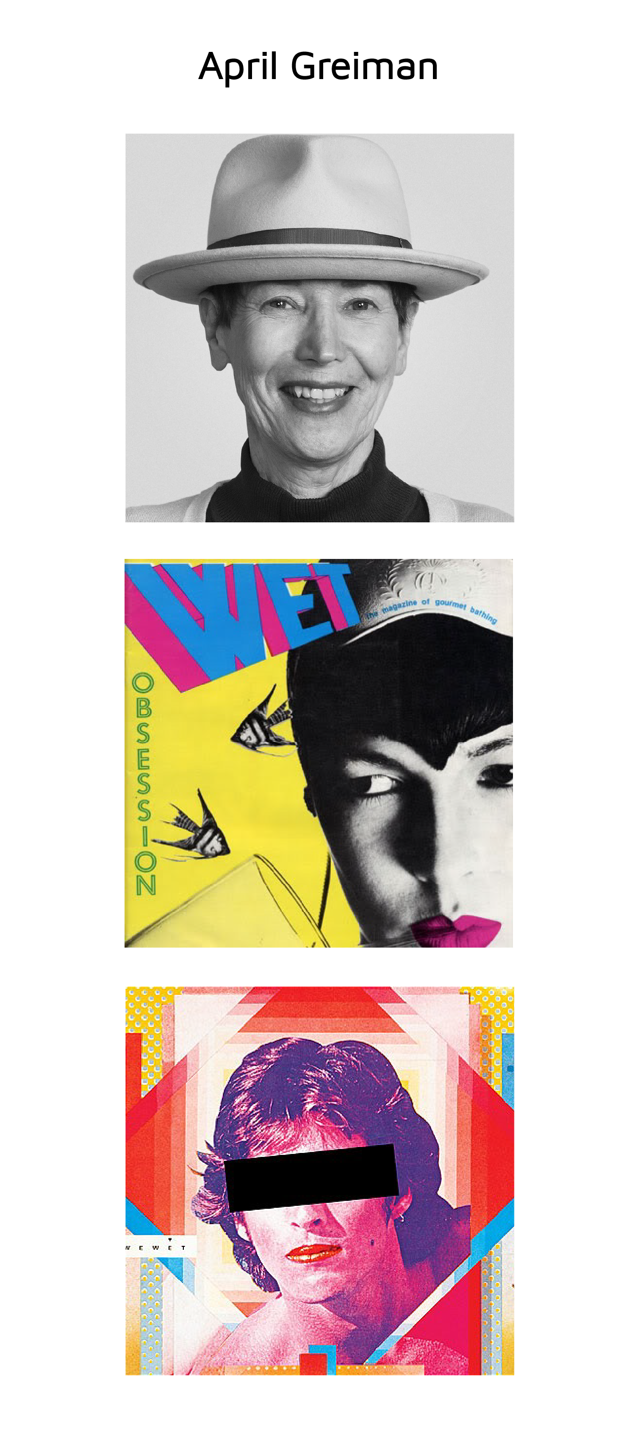
April Greiman was born on September 10, 1948. She grew up in New York City, and she studied art at the Kansas City Art Institute before studying graphic design. In the 70’s she went to Switzerland where she studied at the well known Basel School of Design, where she studied under Armin Hofmann and Wolfgang Weingart, and she soon got interested in the International Style and New Wave. Eventually, she left Switzerland and moved to Los Angeles where she founded something called Made in Space. In the 1970’s digital design was still somewhat new, and many designers were frightened by the development of this digitalization and computer technology. Greiman, on the other hand, embraced it. She used the pixilation of the digital development in her design, and embraced, explored and spread the idea of this new and advanced technology to her advantage in her art and design. Today, Greiman is known as an influential contemporary artist and graphic designer, and she is considered to be one of the first designers of the time to embrace and see the computer in a different light and who truly saw its magnificent potential and design tool. She is also known for introducing the “New Wave” design style in the US. She has received several honorable prizes, while working with art and design, teaching, she has published in magazines, she owns a spa retreat which she designed, worked with and exhibited digital photography, painted murals on huge buildings and she received the Gold Medal for lifetime achievement from the American Institute of Graphic Arts. Today, she works at the Woodbury University, School of Architecture as an art director, and she is quite and inspiration.
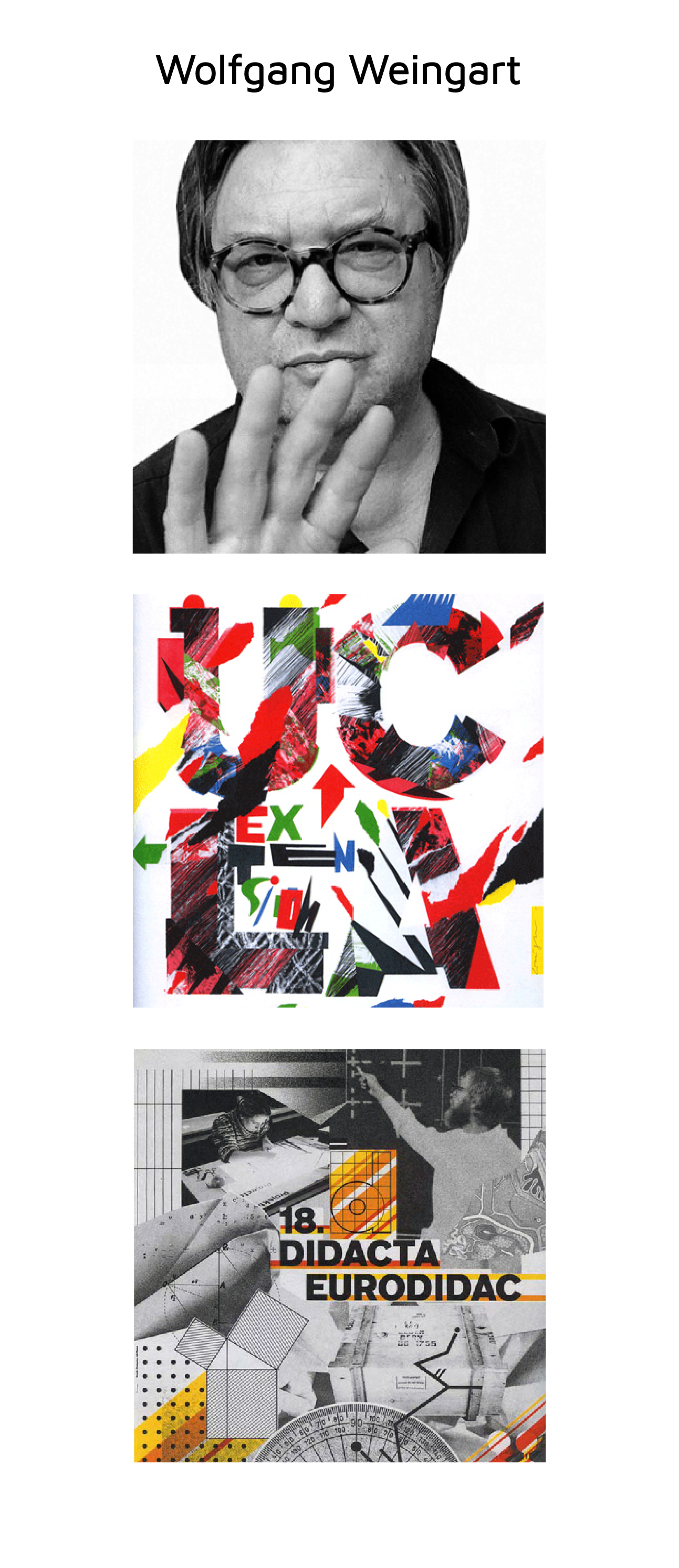
Wolfgang Weingart was born in 1941, and spent his childhood in Germany. He is an internationally influencing and well known graphic designer, and especially known in the punk/new wave style. He has even been acknowledged as the father of New Wave typography. He studied graphic arts in Germany, where he learned about typesetting, linocut and woodblock printing. He developed a strong interest in typography, which lead to him eventually moving on to complete a three-year typesetting apprenticeship in hot metal hand composition at a printing company. During his time there he was encouraged by one of his mentors to continue his studies in Switzerland, and so he later enrolled as an independent student at the Basel School of Design in Switzerland. He excelled in the art of typography, and was eventually invited to teach typography at one of the classes on the school where he became an influential instructor, and until this day he has taught and lectured graphic design all around the world. One of his saying goes like this: “I took Swiss Typography as my starting point, but then I blew it apart, never forcing any style upon my students. I never intended to create a “style”. It just happened that the students picked up and misinterpreted a so-called “Weingart style” and spread it around”.
