


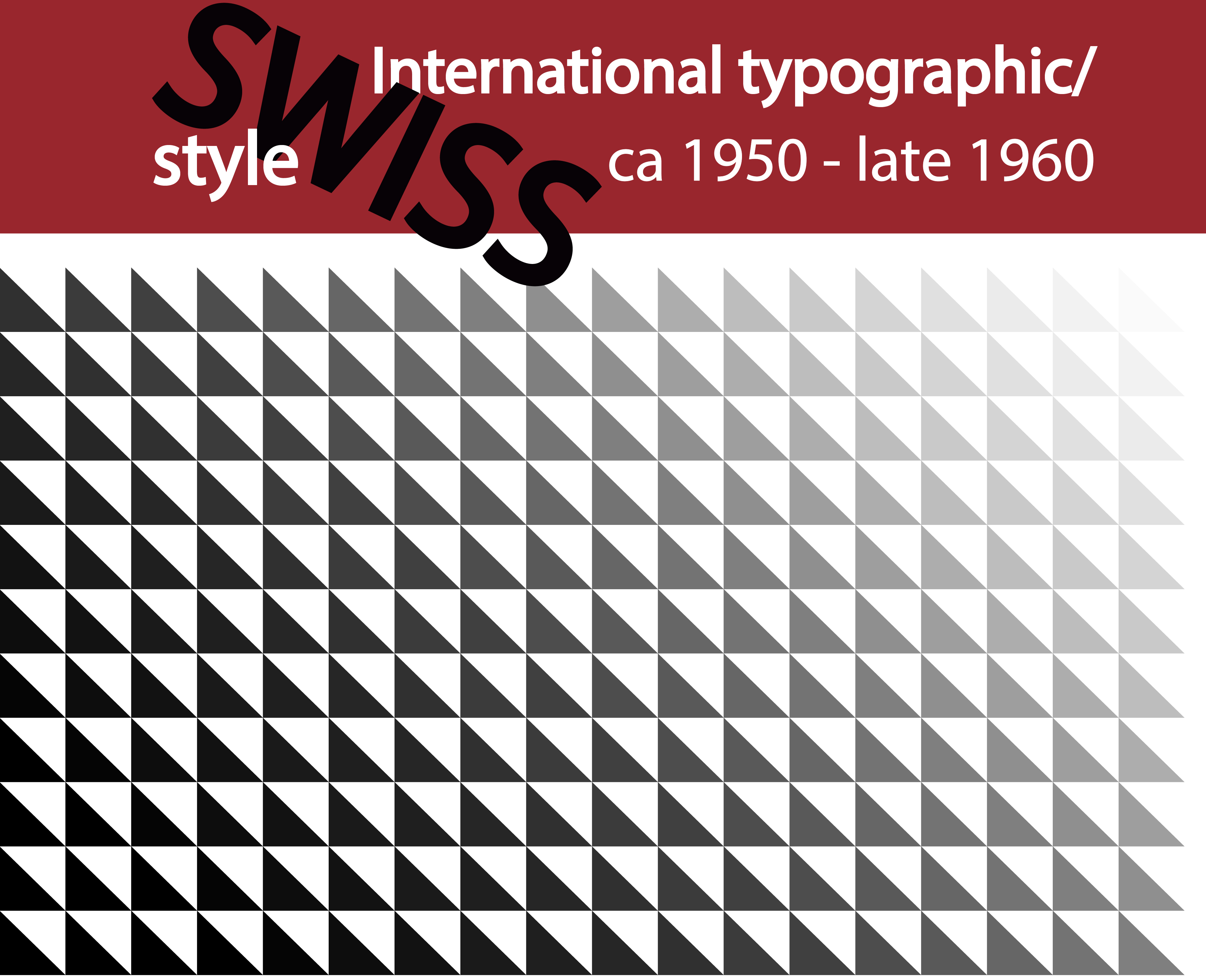
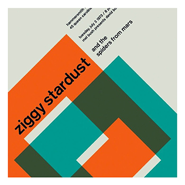
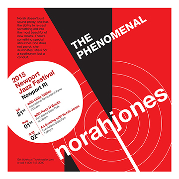
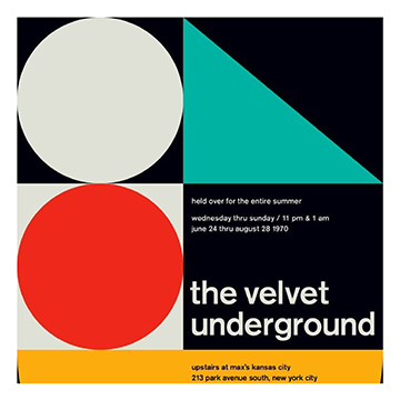
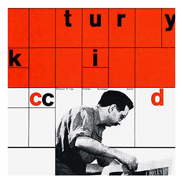
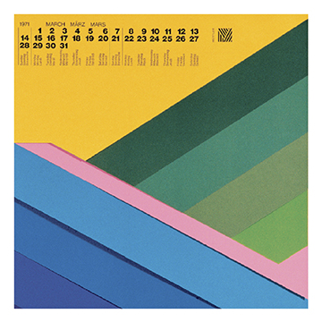
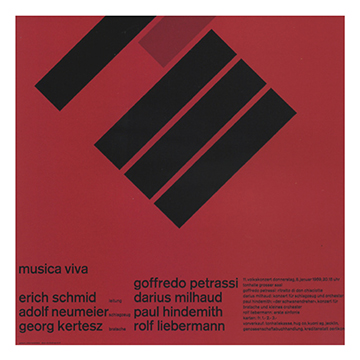
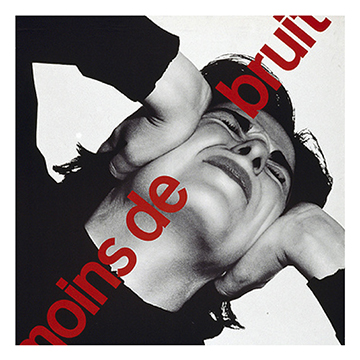
The International Typographic Style, or better known as Swiss Style, had its prime time from the beginning of the 1950’s – late 1960’s. The style had its origin in Russia, Germany and the Netherlands, before it was further developed by the Swiss, and one of the most known typefaces of the time was developed; “Helvetica” which means “Swiss” in Latin. Some keywords describing the style are Cleanliness, readability and objectivity. This time marked the birth of grid-based design, while separating design from fine art. Typical for the Swiss Style is use of grid, asymmetrical layout, sans serif typefaces and most commonly using photography rather than illustrations. The grids developed in this time gave structure, harmony and legibility to the information and content of design. The innovating minds who started the development of the style combined elements of numerous artistic trends and created the beauty and simplicity of the Swiss Style that we still see so much to this day.
Swiss Style was lead by designers Josef Muller-Brockmann at the Zurich School of Arts and Krafts and Armin Hofmann at the Basel School of Design. Swiss Style focused a lot on the development and use of typeface. One of the philosophies of the style was that design should focus on the content and not on decorative extras. The type itself was frequently used as heavy design elements themselves. All design of Swiss Style start with a mathematical grid. Thereafter text is applied, most commonly aligned flush left, ragged right. Usually the fonts are sans serif. Photography is commonly used instead of decorative illustrations. There is clear focus, order and clarity in these designs.
Drawing parallels to significant historical events that may have impacted the style, the 1950’s was the start of some fast changes, with the great depression becoming a distant memory. Times got more gentle after the war and there was little violence and the consumer revolution was booming.
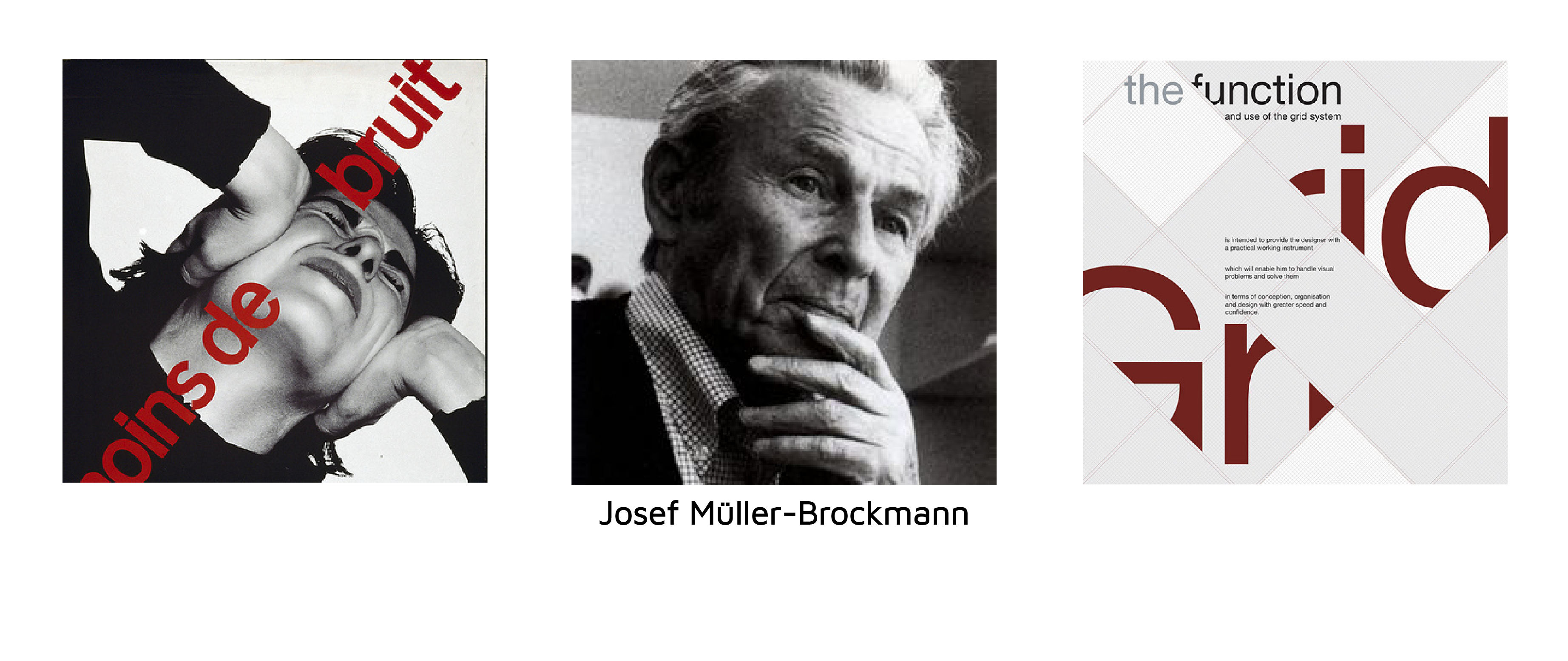
Joseph Muller-Brockman was one of the leading minds and creators behind the Swiss Style. He was influenced by the ideas of several different design and art movements, such as De Stijl and the Bauhaus, and he is maybe the most known name related to the Swiss Style. Brockman was born and raised in Switzerland and he worked as a teacher at the Zurich School of arts and crafts – where all the magic happened. Eventually he published several books of design, including Grid Systems in Graphic Design and The Graphic Artist and His Problems. These books go in detail about his philosophies and became great tools young graphic designers and students who wanted to learn more about the profession. He was working and teaching design for the majority of his life, and later he toured around talking about his work. He died in Zurich in 1996.
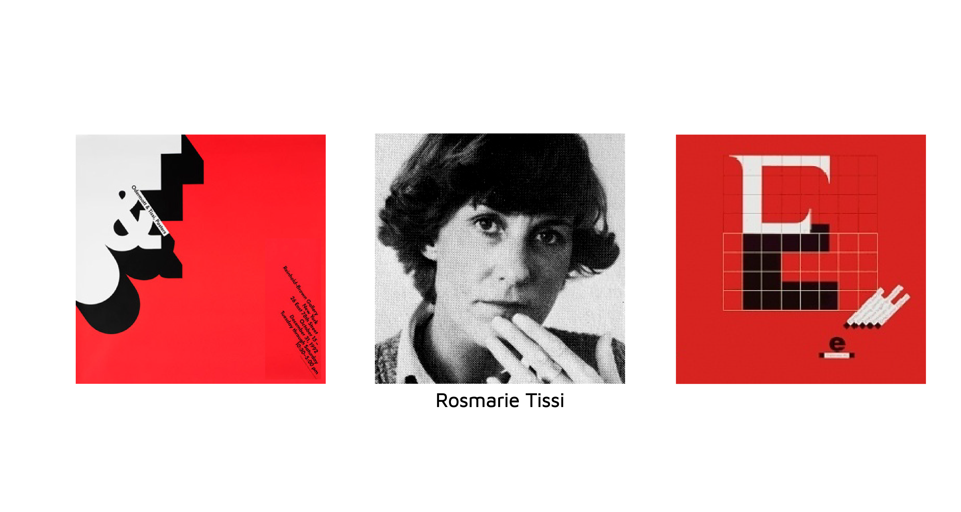
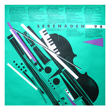
Rosmarie Tissi grew up in an artistic family in Schaffhausen. She had her apprenticeship as a graphic designer in Zurich, with Siegfried Odermatt. Ten years later, after a decade of working together, the two of them started a studio together in 1968, where they worked with several big clients. Tissi’s designs have a certain style-defining characteristics, with a very clear style. She had a passion for travelling, travelling to more than 60 countries, gaining knowledge and inspiration. She travelled not only for pleasure, but mostly for lectures and workshops in high-profiled institutes and universities on every continent. She is the creator of the font Sinaloa, and she has received numerous distinctions and awards. Amond the awards she has won is first price and gold medal at the 11th International Poster Biennial in Warsaw in 1986 and the second prize in the competition for new Swiss banknotes in 1989. She designed the official poster for the FIFA womans worlds cup in China in 2007. Rosmarie Tissi is a reformer of the Swiss School style and member of Alliance Graphic Internationale since 1974. She has also travelled around giving lectures around the world.

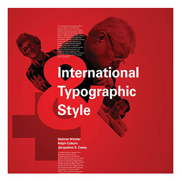






The International Typographic Style, or better known as Swiss Style, had its prime time from the beginning of the 1950’s – late 1960’s. The style had its origin in Russia, Germany and the Netherlands, before it was further developed by the Swiss, and one of the most known typefaces of the time was developed; “Helvetica” which means “Swiss” in Latin. Some keywords describing the style are Cleanliness, readability and objectivity. This time marked the birth of grid-based design, while separating design from fine art. Typical for the Swiss Style is use of grid, asymmetrical layout, sans serif typefaces and most commonly using photography rather than illustrations. The grids developed in this time gave structure, harmony and legibility to the information and content of design. The innovating minds who started the development of the style combined elements of numerous artistic trends and created the beauty and simplicity of the Swiss Style that we still see so much to this day.

Swiss Style was lead by designers Josef Muller-Brockmann at the Zurich School of Arts and Krafts and Armin Hofmann at the Basel School of Design. Swiss Style focused a lot on the development and use of typeface. One of the philosophies of the style was that design should focus on the content and not on decorative extras. The type itself was frequently used as heavy design elements themselves. All design of Swiss Style start with a mathematical grid. Thereafter text is applied, most commonly aligned flush left, ragged right. Usually the fonts are sans serif. Photography is commonly used instead of decorative illustrations. There is clear focus, order and clarity in these designs. Drawing parallels to significant historical events that may have impacted the style, the 1950’s was the start of some fast changes, with the great depression becoming a distant memory. Times got more gentle after the war and there was little violence and the consumer revolution was booming.

Joseph Muller-Brockman was one of the leading minds and creators behind the Swiss Style. He was influenced by the ideas of several different design and art movements, such as De Stijl and the Bauhaus, and he is maybe the most known name related to the Swiss Style. Brockman was born and raised in Switzerland and he worked as a teacher at the Zurich School of arts and crafts – where all the magic happened. Eventually he published several books of design, including Grid Systems in Graphic Design and The Graphic Artist and His Problems. These books go in detail about his philosophies and became great tools young graphic designers and students who wanted to learn more about the profession. He was working and teaching design for the majority of his life, and later he toured around talking about his work. He died in Zurich in 1996.

Rosmarie Tissi grew up in an artistic family in Schaffhausen. She had her apprenticeship as a graphic designer in Zurich, with Siegfried Odermatt. Ten years later, after a decade of working together, the two of them started a studio together in 1968, where they worked with several big clients. Tissi’s designs have a certain style-defining characteristics, with a very clear style. She had a passion for travelling, travelling to more than 60 countries, gaining knowledge and inspiration. She travelled not only for pleasure, but mostly for lectures and workshops in high-profiled institutes and universities on every continent. She is the creator of the font Sinaloa, and she has received numerous distinctions and awards. Amond the awards she has won is first price and gold medal at the 11th International Poster Biennial in Warsaw in 1986 and the second prize in the competition for new Swiss banknotes in 1989. She designed the official poster for the FIFA womans worlds cup in China in 2007. Rosmarie Tissi is a reformer of the Swiss School style and member of Alliance Graphic Internationale since 1974. She has also travelled around giving lectures around the world.


The International Typographic Style, or better known as Swiss Style, had its prime time from the beginning of the 1950’s – late 1960’s. The style had its origin in Russia, Germany and the Netherlands, before it was further developed by the Swiss, and one of the most known typefaces of the time was developed; “Helvetica” which means “Swiss” in Latin. Some keywords describing the style are Cleanliness, readability and objectivity. This time marked the birth of grid-based design, while separating design from fine art. Typical for the Swiss Style is use of grid, asymmetrical layout, sans serif typefaces and most commonly using photography rather than illustrations. The grids developed in this time gave structure, harmony and legibility to the information and content of design. The innovating minds who started the development of the style combined elements of numerous artistic trends and created the beauty and simplicity of the Swiss Style that we still see so much to this day.
Swiss Style was lead by designers Josef Muller-Brockmann at the Zurich School of Arts and Krafts and Armin Hofmann at the Basel School of Design. Swiss Style focused a lot on the development and use of typeface. One of the philosophies of the style was that design should focus on the content and not on decorative extras. The type itself was frequently used as heavy design elements themselves. All design of Swiss Style start with a mathematical grid. Thereafter text is applied, most commonly aligned flush left, ragged right. Usually the fonts are sans serif. Photography is commonly used instead of decorative illustrations. There is clear focus, order and clarity in these designs. Drawing parallels to significant historical events that may have impacted the style, the 1950’s was the start of some fast changes, with the great depression becoming a distant memory. Times got more gentle after the war and there was little violence and the consumer revolution was booming.
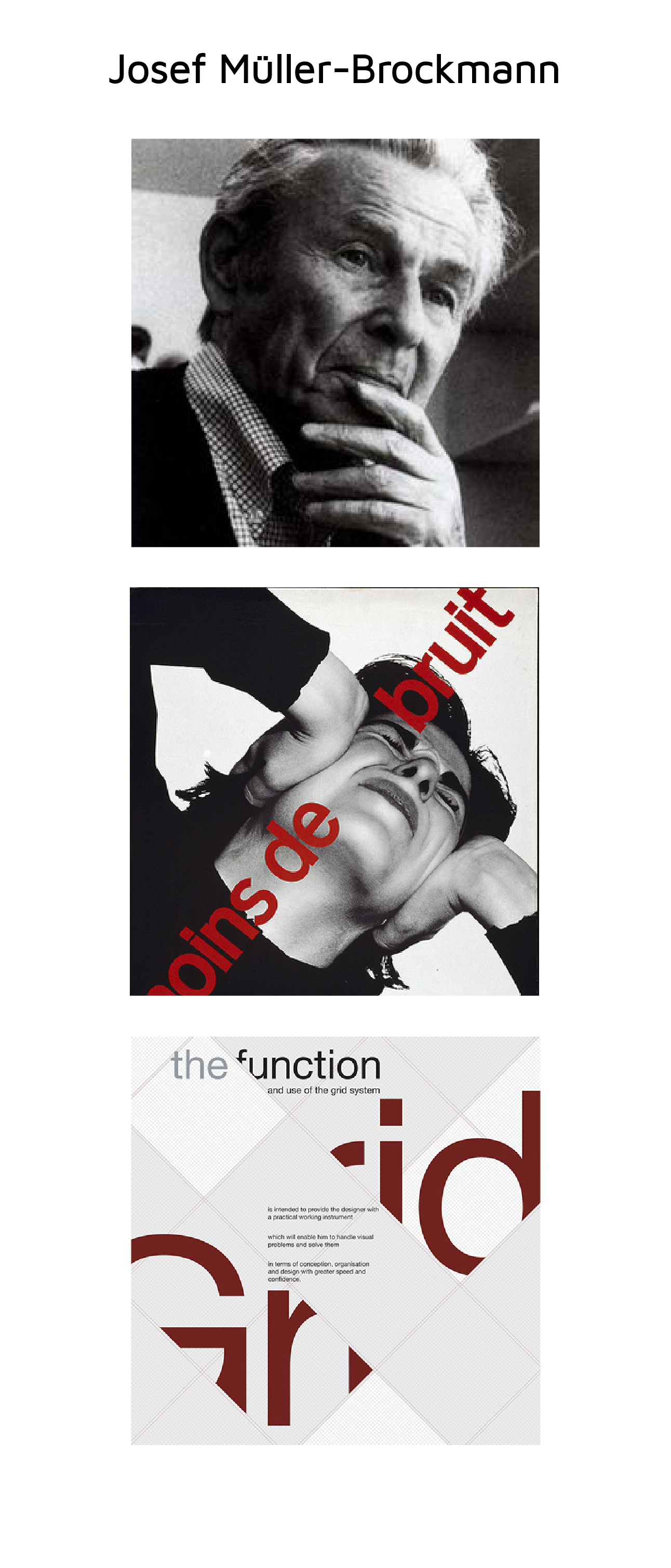
Joseph Muller-Brockman was one of the leading minds and creators behind the Swiss Style. He was influenced by the ideas of several different design and art movements, such as De Stijl and the Bauhaus, and he is maybe the most known name related to the Swiss Style. Brockman was born and raised in Switzerland and he worked as a teacher at the Zurich School of arts and crafts – where all the magic happened. Eventually he published several books of design, including Grid Systems in Graphic Design and The Graphic Artist and His Problems. These books go in detail about his philosophies and became great tools young graphic designers and students who wanted to learn more about the profession. He was working and teaching design for the majority of his life, and later he toured around talking about his work. He died in Zurich in 1996.
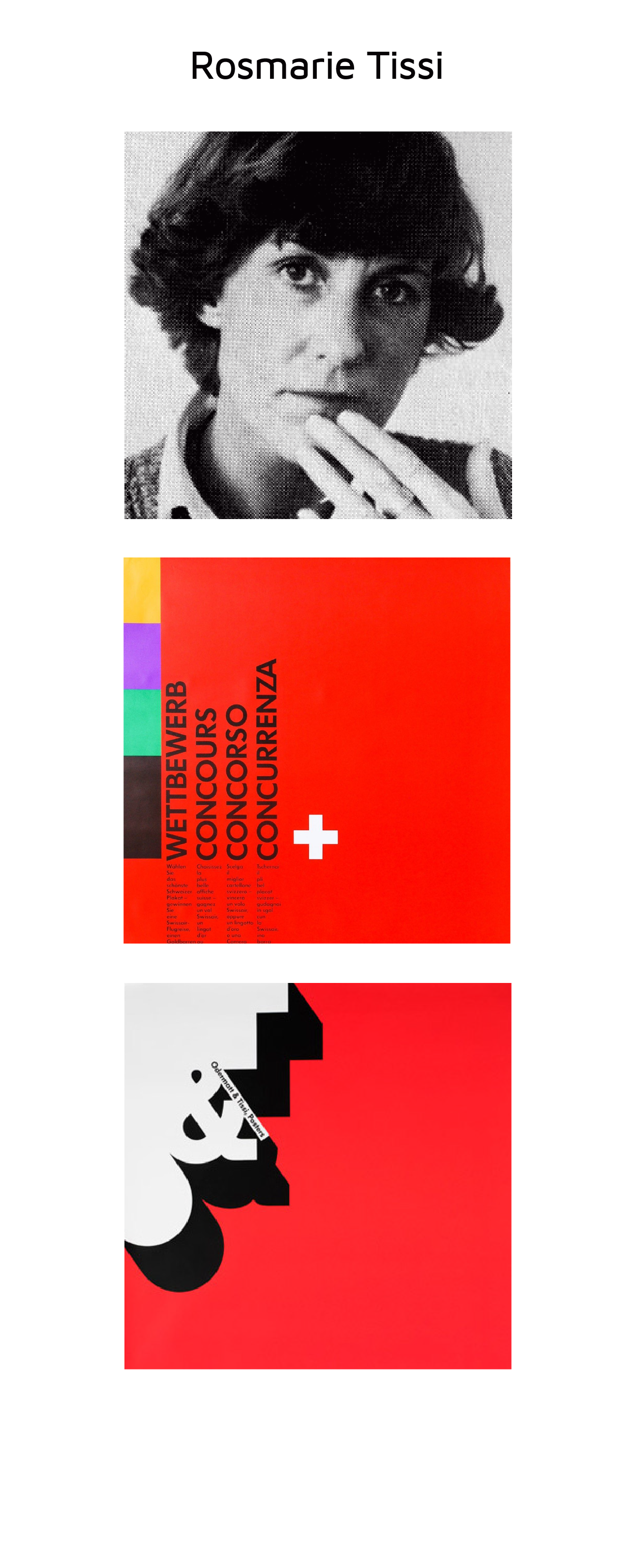
Rosmarie Tissi grew up in an artistic family in Schaffhausen. She had her apprenticeship as a graphic designer in Zurich, with Siegfried Odermatt. Ten years later, after a decade of working together, the two of them started a studio together in 1968, where they worked with several big clients. Tissi’s designs have a certain style-defining characteristics, with a very clear style. She had a passion for travelling, travelling to more than 60 countries, gaining knowledge and inspiration. She travelled not only for pleasure, but mostly for lectures and workshops in high-profiled institutes and universities on every continent. She is the creator of the font Sinaloa, and she has received numerous distinctions and awards. Amond the awards she has won is first price and gold medal at the 11th International Poster Biennial in Warsaw in 1986 and the second prize in the competition for new Swiss banknotes in 1989. She designed the official poster for the FIFA womans worlds cup in China in 2007. Rosmarie Tissi is a reformer of the Swiss School style and member of Alliance Graphic Internationale since 1974. She has also travelled around giving lectures around the world.